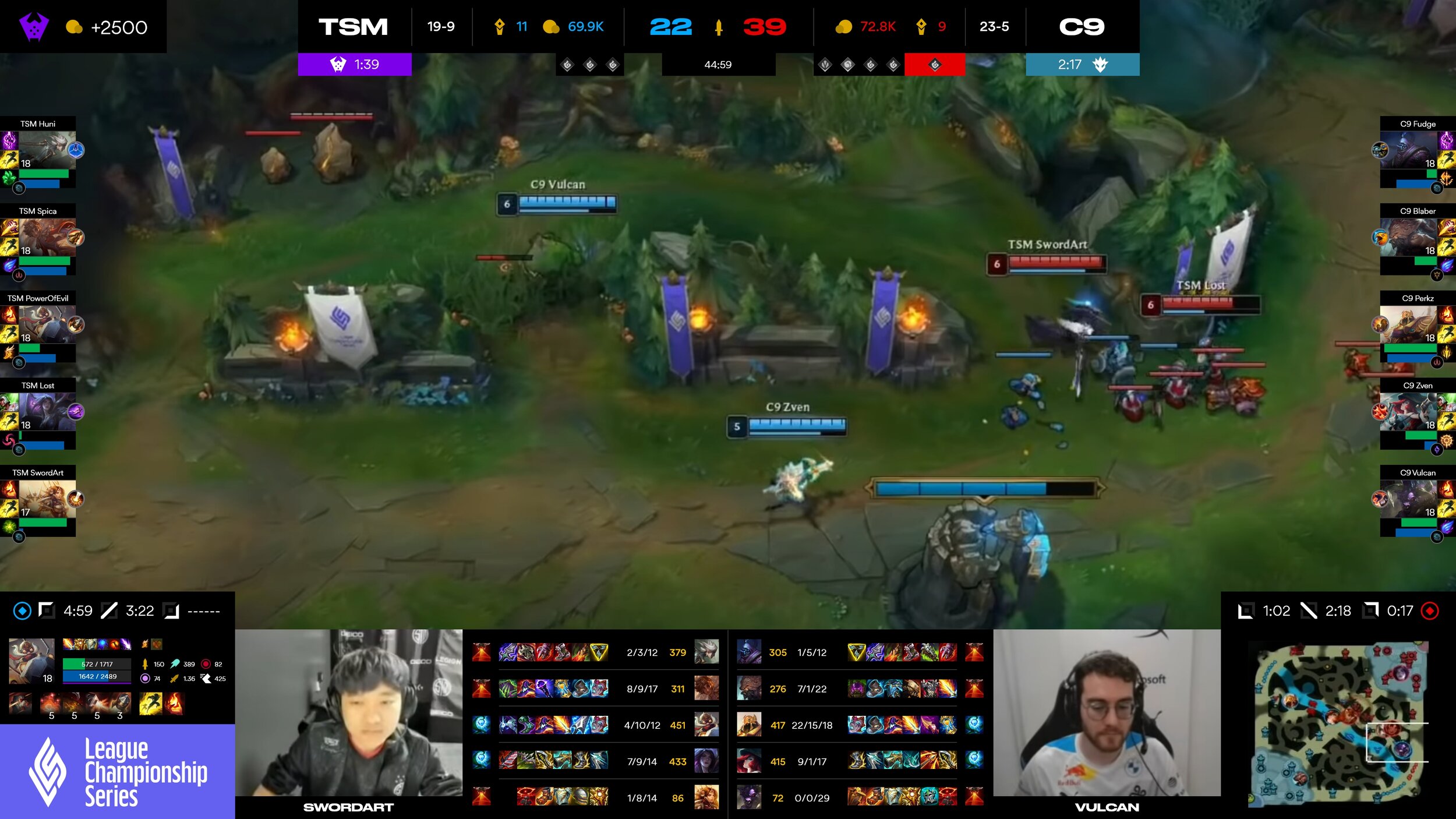
LCS Overlay Concept
As a long time fan of the LCS, one of the main gripes many individuals have - including myself have with the product is the lack of consistency in the overlay for viewers. While strides have been made to improve it over the years, it still falls behind relative to its other regional peers - namely LEC and LCK, so I redesigned it.
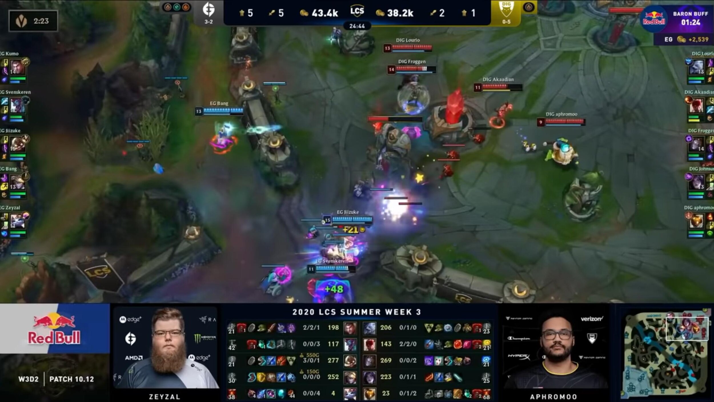
The Problems
Top banner info showing gold, kills and towers destroyed lack hierarchy and all blend together
Dragon (circle next to team logos) icons feel disconnected from other stats
Baron and dragon timers are different styles and while EG - the team on the left side of the screen has baron buff, graphic is on the right side which could cause confusion
Week and day isn’t necessary since they only play 2x a week and on the same days. Additionally patch info isn’t needed since they play on the current patch or 1 behind and changes between patches are minute during the season
Sponsor ads cover up vital info that casters rely on - causing them to have to ask production for stat updates consistently throughout the course of a game
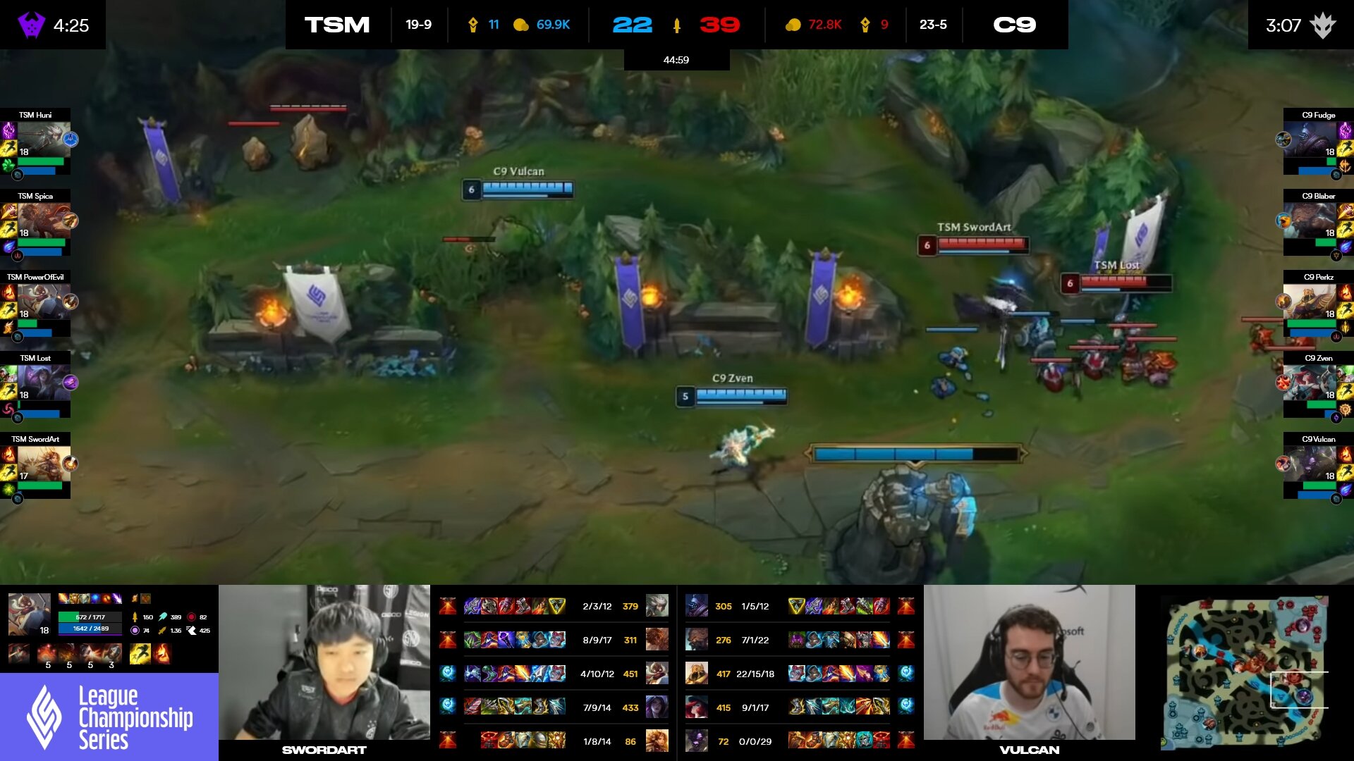
Base Overlay

Dragons + Buffs
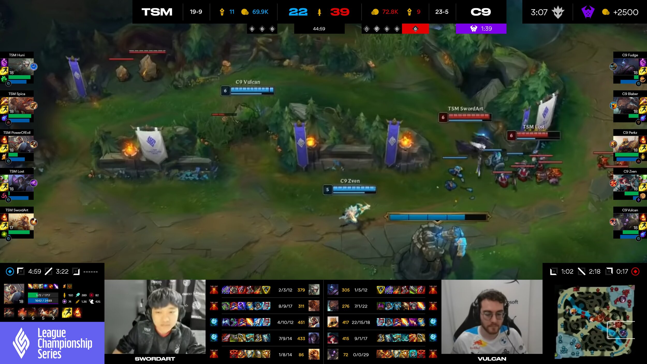
Dragons + Buff Right Side
The Solution
Adjusted color, spacing and made the icons bigger to create hierarchy that’s easy to read and understand. Since kills are the easiest way to determine whose winning in 99% of situations, made that the focus over gold
Removed week, day and patch info and slid down sponsor info so that the champion panel is available to casters and viewers. Also moved the passive icons from above the champion info panel (where I have inhibitor respawn timers now) inside the info panel so they no longer overlap
Cleaned up champion panels on the left and right sides so names are easier to read and HP/Mana are mirrored so it’s easier to tell when someone is low on the right hand side
Added the dragon icons under gold and tower area along with soul (red rectangle) - permanent buffs throughout the game - to give space under team names for temporary buffs - baron and elder

Top Banner
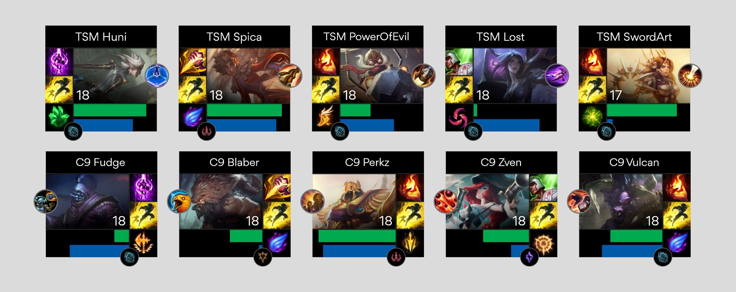
Champion Info
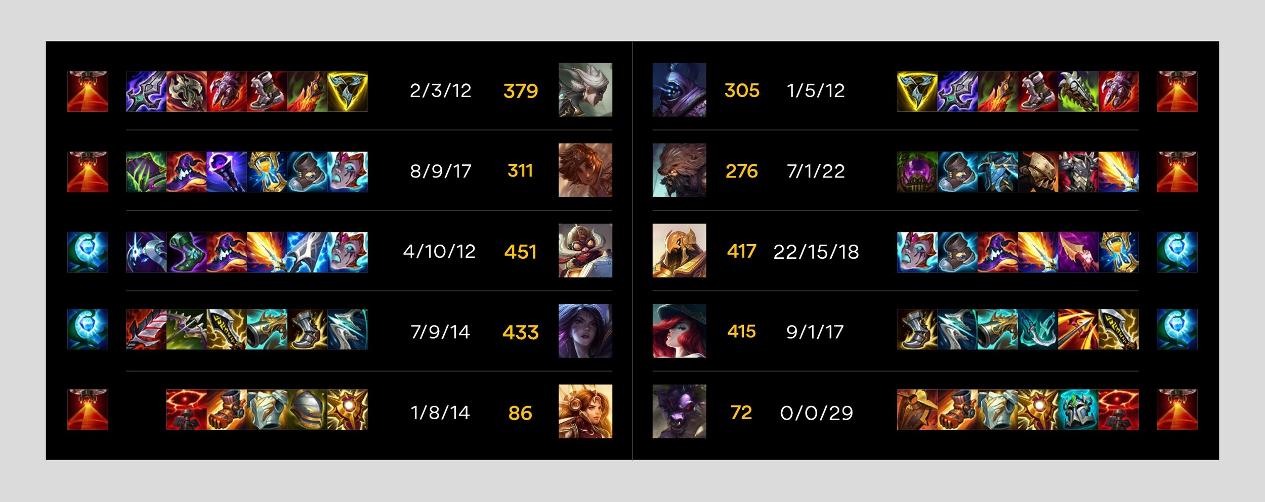
Main Info Panel
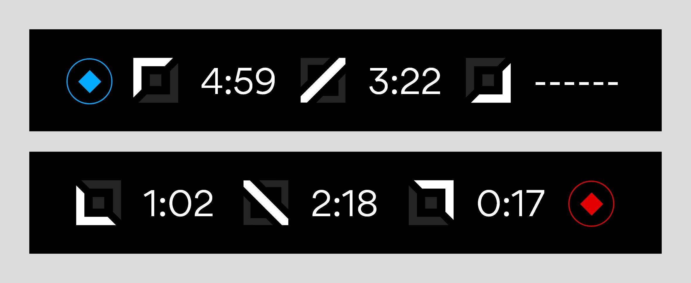
Inhibitor Respawn Timers
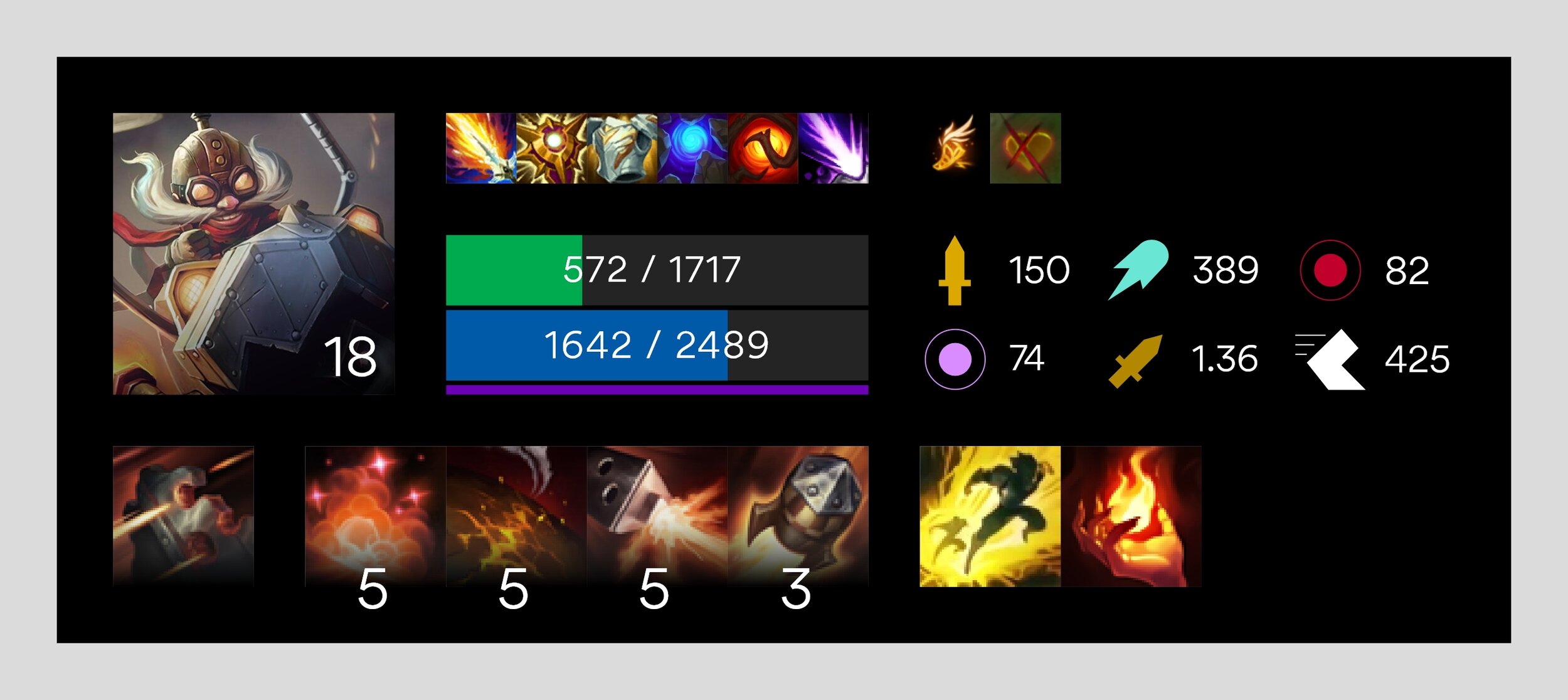
Spectate Champ Panel
Credits
Design: Billy Huynh