As a long time fan of the LCS, one of the main gripes many individuals have - including myself have with the product is the lack of consistency in the overlay for viewers. While strides have been made to improve it over the years, it still falls behind relative to its other regional peers - namely LEC and LCK, so I redesigned it.
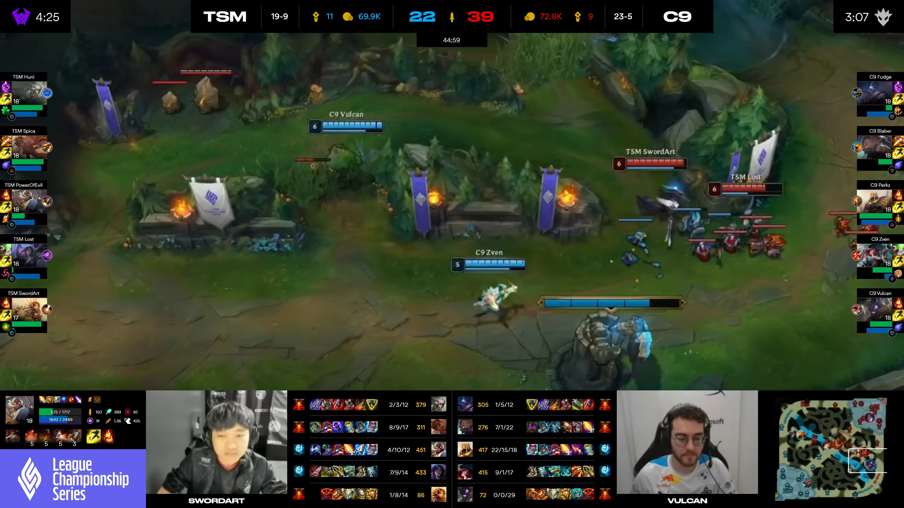
Below is the old overlay they were using at the time.

Adjusted color, spacing and made the icons bigger to create hierarchy that’s easy to read and understand
Removed week, day and patch information and slid down sponsor logos over so that the champion panel is available to casters and viewers
Compacted and moved inhibitor respawn timers above selected champion info panel so it is not longer overlaid on top of champion information
Cleaned up champion panels on the left and right sides so names are easier to read and HP/Mana are mirrored
Compacted buffs under each teams' respective side with dragon stacking and dragon soul centrally and prominently placed as it is the most important and only permanent
Updated the font so the information is easier to read


Close up of each individual component that was adjusted.


Art Direction: Billy Huynh
UI Design: Billy Huynh